Learning how to write blog posts was a scary task when I first started. Just when I started to get comfortable with the idea of a blog post, my coach told me that I needed calls to actions. Each piece of content you create should have a call to action button, I was told. Just like some of you, I didn’t know what went into creating a call to action.
Great calls to action are very clear, eye-catching, and aligned with your audience’s buying stage. You must determine where your potential client is within their decision-making process. When you know your audience, you’ll know exactly where and when to place your calls to actions to get good results.
Calls to Action (CTA) help make the sale. The CTA is the part of your sales letter, email, page, blog post, or other content that “calls” your reader to action.
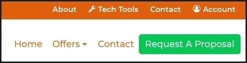
Here is the call to action that I’m using on this site. The green button is calling out to my audience to click on the button to fill out a short proposal questionnaire.
Calls to Action (CTAs) are more than a button that says, “buy now”. It’s about much, much more. Effective CTAs compel your reader to act, to do something.
Sometimes that something is about getting them on your list, getting them to connect with you on social media, attend your live event, or whatever. Either way you will want your next call to action button to guide your reader to taking the next action step toward becoming a customer.
Examples of Calls to Actions
- Download a Whitepaper
- Download a Free eBook
- Sign up for a Webinar
- Get a Coupon
- Attend an Event
- Sign up for More Information
- Download a Checklist
- Buy Your Widget
The Anatomy of a Good Call to Action
Your call to action button must say more than “buy now”. It is not compelling to your reader. You should start by focusing your attention on the placement, size, color and headlines to start. Now is the time to not only know your why, but also your readers why and how they must mesh.
Sizing – It’s important to ensure that you choose the right size for your call to action. You don’t want it too small so that it doesn’t stand out to your reader, but you don’t want it to look too big either. Ensure your sizing is consistent across the other content on your page within your website.
Image Quality – It’s very important that you use images that your reader can relate to and that start to help your reader get to know you. This happens by understanding your brand and your voice as a business and choosing the right type of images to represent that to your reader.
An Effective Headline – Your call to action should include an effective headline that tells your audience what to do. A great example is the action verbs we use on the buttons on our website. The buy now, download now, and sign up now are all action verbs that won’t confuse your audience about what they’re clicking on and what they’re agreeing to do.

Kelly has done a wonderful job creating an eye-catching call to action. Colors, image headline, it’s all there. Her CTA is located in the sidebar on her blog posts. It has great color and especially like how she uses the 2-step call to action.
Color – You also want to make sure that you use the right colors for your site so that the call to action stands out. Look at it and ask yourself whether it stands out or clashes? Does it look professional and command attention? It wouldn’t hurt to check out what colors work better for buying.
Form – You can create your call to action in many forms. For example, should you use a button or another type of image? Should you put a sign-up form under each blog post? What about a CTA to connect on social media? These are all forms of CTAs that get good results.
Text – When you create a CTA, should you put text on the button that gets attention? Should you give an example to your audience on what to write inside the boxes they need to fill out to sign up for something? It depends on your reader. Keep in mind that you want the attention of your ready to take notice of what you’re saying. You want your text to stop the reader and compel them to click so that you get the conversion.
Understand Why – One of the biggest things you need to know when you create your call to action is why you’re creating it. What do you want your reader to do and why? When you can understand why in terms that your reader understands and relates to, you’ll be able to get higher conversions on all of your CTAs.
Placement – The other thing you must know about CTAs is where you should place them. Placing them in multiple places is usually the best answer to make sure that you give your audience every opportunity to decide to answer it. We’ll talk more on placement later.
Learning to craft a good call to action takes some thought and consideration to ensure it works to get you your results. Your CTAs will need to be tested, retested and then tested again. A great way to test your CTAs would be to use an A/B testing strategy. You're searching for the best wording and placement of your CTA that will yield the best results.
Places Where You’ll Want an Effective CTA
You can place CTAs wherever you like, and it’s usually better if you place them in multiple places. You might place a CTA at the end of your blog post, in multiple places on a sales page, at the end of your email, or even inside your whitepaper, eBook, or webinar.
All the stages of your readers’ buying cycle need a strong CTA. The right call to action at the right time is imperative if you want to have a good return on investment. CTAs help you to build your list and influence your audience with your products and/or services. There are many places to put a strong call to action; let’s look at a few.
Above the Fold

When you see others advising you to place your CTA “above the fold,” take heed. To implement this stragey you will need to know what your reader sees when they click on your email, website, or other form of content. MonsterInsights quickly guides the reader towards their next step, “Get MonsterInsights Now”. It is important when determining where “above the fold” (which is the time before your reader must scroll or swipe) to place your CTA.
This is not always right as your reader clicks through to the page because they may not know anything about you yet. You should find a way to tell them how you’ll solve their problems prior to placing the CTA. One way to deal with this is to use multiple CTAs.
At the Bottom

Most people are used to scrolling today. Thus putting a CTA at the bottom of your copy is a great way to ensure that your audience is easily able to locate the “what to do next” button, (i.e. your CTA button). You don’t want to make it hard for people who read and engage with your content to figure out what they should do next.
Here is another example of a what I call a 2-step CTA. The Smart Passive Income blog has its call to action located at the bottom of the page. Pat uses a button to have the form pop-up for the reader.
I also like this particular style because it allows the reader to choose whether or not they would like to see your form.
Below the Fold
Whenever you choose to place a CTA below the fold, it’s important that you use directional cues to point to the CTA. You can do this with content, images, and even actual arrows. This strategy works great when you’re using a storyboard or infographic. It allows you to your audience the information they need to know in order to make a choice to buy from you.
Elsewhere
You can put CTAs anyplace and in multiple places. Let's take a sign-up form. It can be placed underneath your blog post so that your readers can easily get more information. You can also put that same sign-up form on the sidebar of your site, along side the blog post. Putting them in multiple places allows your audience time to get to know you through your content so that they won’t miss out.
The biggest clues to help you determine where to place your CTA is to understand how your reader consumes your content. Once you find this out and know where they are in the decision-making process, you can call them to action with the right call to action. You learn all of this by testing different types of CTAs to find out what works best with your audience. You start with an educated guess and move from there to make sure your CTAs work as well as they should.
How does placement affect the Results of Calls to Action
You may have a call to action to sign up for the webinar, but inside the webinar, you may have a sign up for your six-week course. Inside your six-week course, you may have a CTA for your one-on-one coaching program. As you probably can see, the calls to actions can continue indefinitely if you have a better product to promote.
The best thing to do is to only have one CTA per item. However, if needed you may include choices for the CTA as well. Once you become more advanced, you should start to add upsells and down sells within your CTA strategy. Your call to action should be direct, to the point, apparent at first glance, and with regard to the reader to be of any good.